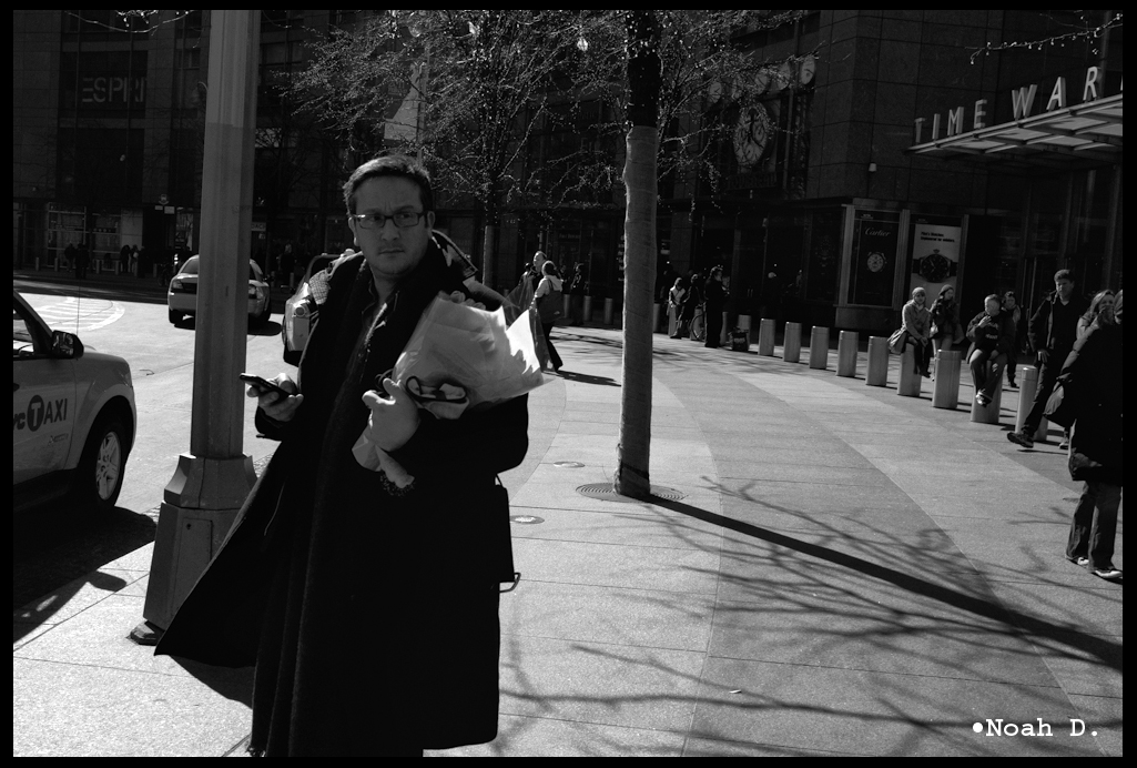
Not all black and white is created evenly.
I like black and white to look like film, not color-stripped digital. No, clicking “grayscale” or whatever in iPhoto (or even Photoshop) doesn’t cut it.
So, what’s the difference? Well, a snapshot black and white on something like Ilford HP5 or Kodak Tri-X is going to be somewhat imperfect. Scratch that: very imperfect. The sky is going to be blown when taken into the sun. And, since it was taken into the sun and you would have mentally made the compensation for that, but since nobody ever thinks the sun is quiet as bright as it actually is, the blacks are on their way to getting lost WHILE still not getting far enough for the sky to maintain any tone.
So, that’s how I decide to have my black and white digitals look. Take into consideration EVERYTHING. Its why I’m thankful for my time on film, it helps me to think of how film responds in all sorts of situations.
Photoshop CS4/CS5 has the Black&White conversion mode. Use it. It works similarly to how Lightroom’s black and white color conversion works. EVERYTHING is editable. All colors, response between shadows and highlights and the interaction of edges. It matters, believe me. Before CS4 and the new Lightrooms, I used “monochrome” in Channel Mixer.
Live intentionally. Shoot intentionally.
Stay tuned,
-Noah D.