Sleepy little towns are the most difficult in which to photograph. Or maybe its because that’s where I’m originally from and maybe I hardly see the little “quaint” and “awwwwww, that’s SO Americana!” as nothing special.
Nothing to photograph here, move along… move along…
Its my fault, there’s plenty going on (I mean, kinda?) but when there’s a street fair/festival in the otherwise uneventful downtown area, I just have to make an appearance.
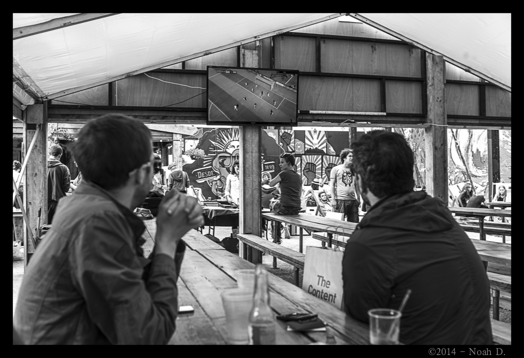
 “But we’ll miss the game!”
“No, we won’t! They’ve got a huge screen down there!”
Isn’t technology wonderful?
Speaking of technology, I didn’t come to talk about the benefits and hazards of downtown small town Arkansas. It just so happens, a certain image was a great example of something I’ve been meaning to talk about:
Color.
“Color, you say? But… like… 8/9ths of your images are black and white!”
Correct. However…
Take a look at the following two images.
 …and…
…and…
 This is an example of the problem of red hue shift and saturation. Exactly the same everywhere else except the red.
Older cameras – the Leica M8 falls into that category – were horrible at it. It is largely because the color you are seeing is actually a calculation the camera is making trying to make colors that it actually can’t “see.”
To counter act this you have to have to tell the camera after the fact that it is – in reality – wrong and here’s how to fix it. This is called “calibration”… yes, just like a printer or a monitor, calibrating a camera is a significant step in post-processing.
If you have ever shot RAW, it is absolutely a requirement, it comes with no adjustments anyway. (That’s what makes it RAW.)
Alright, well, in the Developer tab of Lightroom, on the right side, all the way at the bottom: “Camera Calibration.” That is what this is for. There is usually a “Camera Standard” option along with two versions of Adobe CR and maybe one or two other things.
When you change them, it is not unusual for the colors to be wildly different. For instance, the top frame is the “Leica Camera Standard” making the shirt a brick red and the bottom is Adobe CR v4.4, making the shirt a little of the weird pinkish red.
Which is accurate?
Without getting out the slide rule and all the nerdy crap of splitting hairs, this is how I do it:
Eyeball it.
That’s right. Eyeball it. Do you remember those shirts pinky-ish magenta or red?
Simple as that.
Okay, come out of the woodwork and get all the color hue cards out and pantone match and blah blah blah. I, for one, see no need in doing that, but that’s my personal opinion… and it works for me.
Why?
Because this is what I’m probably going to settle on anyway…
 In the interest of full disclosure, I prefer the top version with the deeper red – the original Leica Standard Calibration – for this image. Even though, that’s not always the case.
Splitting hairs aside, sleepy Searcy became just a little more lively this weekend.
 Just a bit.
 It was certainly far louder than usual.
And no country music!
Okay, there was country music… but a guy can wish, right?
Stay tuned…
-Noah D.